How Does Store Layout Design Improve the Retail Experience? In this article, we will learn key strategies that keep customers engaged and improve sales.
Table of Contents
ToggleIntroduction
Store layout design plays a crucial role in shaping the retail experience. It influences how customers interact with products and navigate the space. A well-thought-out layout can make shopping enjoyable and efficient. Retailers prioritize layouts because they directly impact sales and customer satisfaction.
Every customer walking into a store comes with expectations. Some seek specific items, while others want to browse. A good layout caters to both groups. It creates a balance between easy navigation and the joy of discovery.
The store’s entrance sets the tone for the shopping experience. It acts as a gateway to what lies inside, and retailers strategically design this area to capture attention immediately.
Bright lighting, promotional displays, and clear signage often greet customers at the entrance. These elements encourage shoppers to step inside. Without an engaging entrance, customers might leave before exploring the store.
Guiding Customer Flow
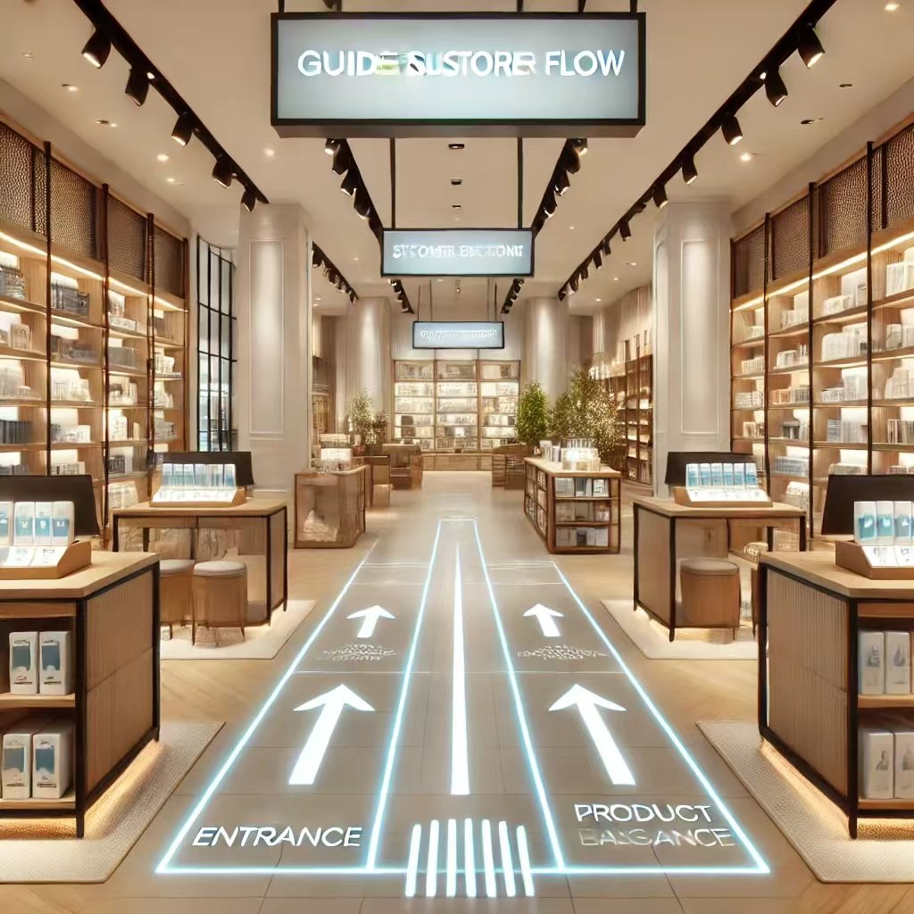
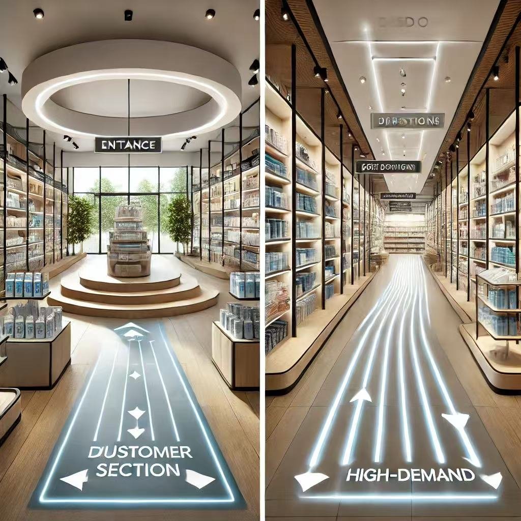
The Importance of Flow in Store Layouts
Guiding customer flow is essential for any retail store. A well-designed layout helps customers navigate the space easily, directing them to key areas while encouraging them to explore more.
Retailers focus on creating a natural flow. They want customers to feel comfortable moving through the store. When flow is smooth, shoppers stay longer and engage with more products. This increases the likelihood of purchases.
Pathways That Lead the Way
Pathways play a major role in guiding customer flow. They create a clear direction for movement. Retailers design pathways to encourage exploration.
For example, many stores use a loop layout. This directs customers in a circular path through the store. Along the way, they encounter various sections and products. This layout ensures they see most of the merchandise.
Straight pathways also work in certain cases. They are ideal for smaller stores with limited space. These pathways lead directly to the main products or checkout areas.
Strategic Placement of Popular Items
Retailers often place popular or essential items in the back of the store. This is a deliberate strategy. It encourages customers to walk through other sections first.
For example, grocery stores place milk and bread far from the entrance. Shoppers must pass multiple aisles to reach these items. Along the way, they notice other products. This increases the chance of impulse purchases.
The same strategy works for clothing stores. Placing trendy or discounted items deeper inside attracts customers further in. Retailers maximize exposure to the rest of the inventory.
Using Signage to Enhance Flow
Signage plays a vital role in guiding customers. Clear signs reduce confusion and frustration. Shoppers appreciate knowing where to find what they need.
Directional signs point to major sections like “Electronics” or “Sale Items.” Promotional signs draw attention to featured products or discounts. Both types of signage improve navigation.
Retailers also use floor graphics to guide customers. Arrows or markers on the floor create visual cues. These cues direct traffic seamlessly, even in crowded spaces.
Creating Visual Anchors
Visual anchors are key to effective flow. These are prominent displays or areas that grab attention. Shoppers naturally gravitate toward them.
For instance, large promotional displays at the store entrance act as visual anchors. Customers are drawn in and start their shopping journey. Retailers place similar anchors throughout the store to maintain interest.
Displays near the checkout area also serve as anchors. They create a stopping point where customers consider last-minute purchases, enhancing the overall flow and increasing sales.
Balancing Open Space and Density
Retailers balance open space and dense displays to optimize flow. Too much open space can feel empty and uninviting, while overcrowded layouts make navigation difficult.
Open spaces near the entrance provide a welcoming feel. Shoppers have room to adjust and orient themselves. Further inside, displays become denser to showcase more products.
Retailers carefully analyze customer behavior to find this balance. They ensure shoppers can move freely while engaging with the merchandise.
Encouraging Exploration Through Zoning
Zoning divides the store into different areas. Each zone has a specific purpose, such as showcasing seasonal items or premium products. Zoning guides customer flow by creating distinct sections.
For example, retailers often place high-demand products in central zones, seasonal displays near entrances, and clearance items in less prominent areas to encourage exploration.
Zoning also helps retailers highlight certain product categories. Shoppers naturally move from one zone to another. This keeps them engaged and ensures they see more of the store.
Technology and Customer Flow
Technology improves customer flow in modern stores. Digital kiosks help shoppers locate items quickly. Interactive maps guide them to specific sections.
Some stores use sensors to analyze customer movement. This data helps retailers optimize layouts. They adjust pathways and displays to match shopping patterns.
Mobile apps also play a role. Retailers offer apps that integrate with in-store navigation. Shoppers use their phones to find items and access promotions. This technology enhances the shopping experience and flow.
The Psychology Behind Flow
Psychology influences how retailers design customer flow. They understand that shoppers prefer smooth, uninterrupted experiences. Crowded or confusing layouts create stress and reduce sales.
Retailers use colors, lighting, and music to guide behavior. Brightly lit areas with soft music encourage exploration. Darker sections with focused lighting draw attention to specific products.
Retailers also create “pause points” where customers can stop and browse. These areas break up the flow and encourage deeper engagement.
Conclusion
Guiding customer flow is more than arranging pathways. It’s a strategic process that combines design, psychology, and technology. Retailers use pathways, signage, and zoning to lead customers through the store. They balance open spaces with dense displays to create a welcoming environment.
By focusing on customer flow, retailers improve the shopping experience and boost sales. Shoppers feel comfortable, engaged, and eager to explore. Effective flow design benefits both customers and businesses. It’s a key factor in retail success.
Maximizing Product Visibility
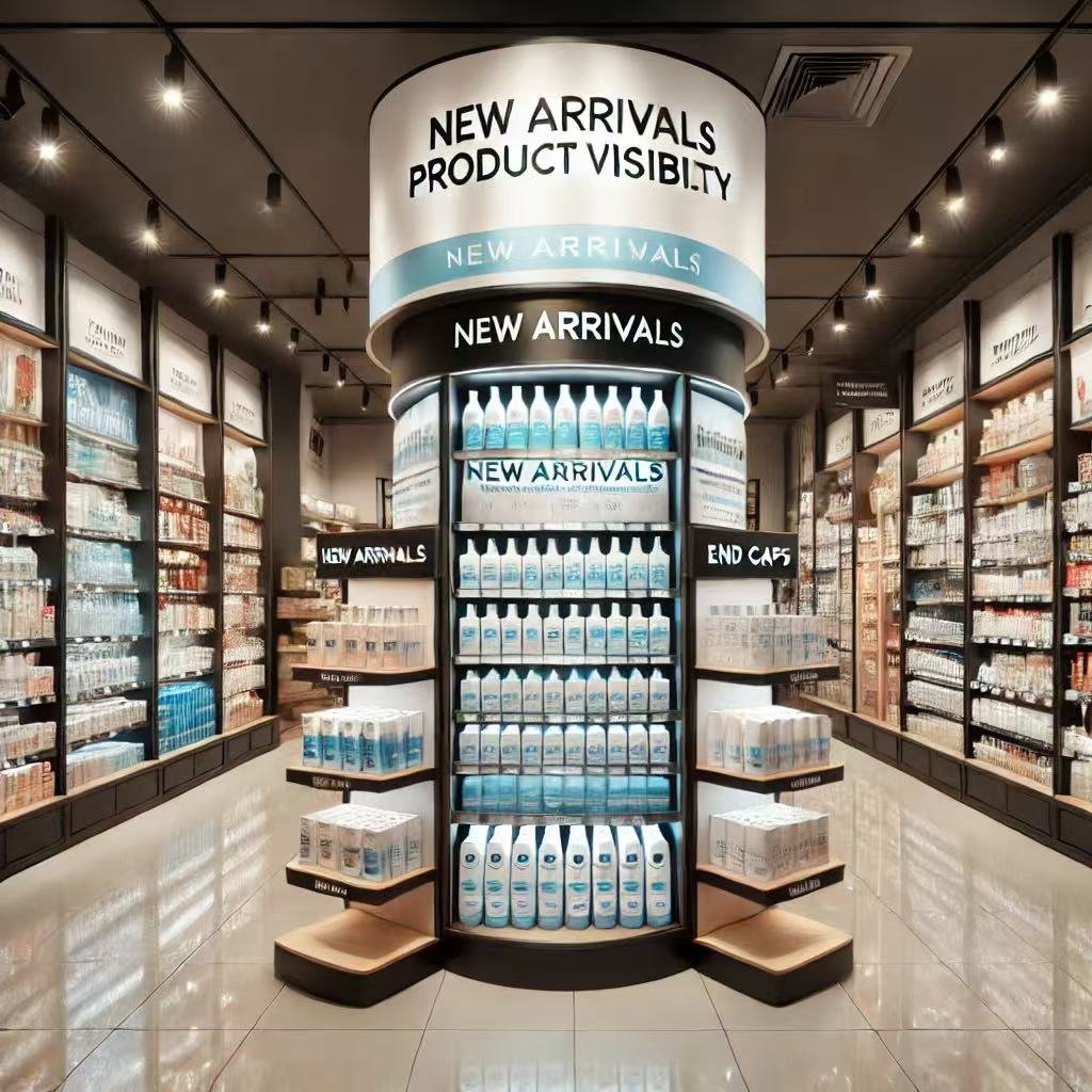
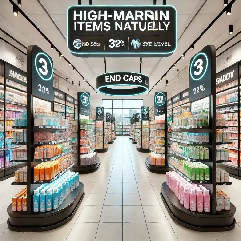
Strategic Product Placement
Retailers carefully choose where to place products in the store. Placement matters because it directly impacts customer engagement. Popular items often sit at eye level. This makes them easier to notice.
End caps are another effective tool. These are the displays at the end of the aisles. They feature high-margin or promotional products. Customers walking through aisles naturally notice these items. This strategy drives impulse purchases.
Seasonal products also receive prime locations. Retailers place these items near the entrance. This ensures customers see them immediately. Shoppers are more likely to buy items that feel relevant to the current season.
The Role of Lighting
Lighting plays a critical role in product visibility. Retailers use bright, focused lighting to highlight key areas. Dimly lit sections are less likely to attract attention.
Spotlights often illuminate high-value products. This draws the customer’s gaze and adds emphasis. For example, jewelry stores use lighting to make diamonds sparkle. The right lighting makes products appear more appealing.
Ambient lighting also matters. A well-lit store creates a welcoming atmosphere. Customers feel comfortable browsing. Retailers carefully balance general lighting with focused lights to ensure a pleasant experience.
Using Colors to Guide Attention
Colors influence where customers look. Bright or contrasting colors naturally draw attention. Retailers use colorful signage or packaging to make products stand out.
For example, sales tags often appear in red. This color symbolizes urgency and excitement. Customers associate it with discounts. As a result, they focus on these areas.
Product displays also benefit from color coordination. Grouping items with similar colors creates a cohesive look. This technique helps products feel organized and visually appealing.
Creating Eye-Catching Displays
Displays are a powerful tool for visibility. Retailers often create themed or interactive displays to engage shoppers. These displays showcase featured products and tell a story.
For instance, a beach-themed display in summer highlights swimwear and accessories. Props like sand and umbrellas enhance the theme. Customers feel drawn to explore the section.
Interactive displays take engagement further. Customers can touch or try products. Beauty stores often use this strategy. They provide testers or interactive screens to explain products. This encourages customers to spend more time in the store.
Leveraging Technology for Visibility
Technology enhances product visibility in modern retail. Digital screens display advertisements or promotions. These screens catch the customer’s eye with motion and light.
QR codes add interactivity. Shoppers scan codes to learn more about products. Retailers use this to provide detailed information without overwhelming displays.
Augmented reality (AR) is another tool. Stores use AR to let customers visualize products in real-world settings. Furniture retailers, for example, allow customers to see how items fit into their homes. This innovation boosts visibility and interest.
Using Store Layouts to Increase Visibility
The overall layout influences visibility. Retailers position best-selling items along main pathways. This ensures customers encounter them while navigating the store.
Cross-merchandising is another effective technique. Retailers place related products together to encourage additional purchases. For example, a wine display might include glasses or bottle openers nearby.
Zoning also helps. Retailers divide stores into sections based on product categories. Clear divisions make it easier for customers to find and explore specific areas.
The Power of Signage
Signage is essential for directing attention. Large, bold signs grab the customer’s focus. Retailers use them to promote sales, new arrivals, or featured products.
Directional signs guide customers to specific sections. This reduces frustration and improves the shopping experience. Informative signs provide details about products, making them more appealing.
For example, eco-friendly labels highlight sustainable items. Customers interested in sustainability feel encouraged to buy. This simple strategy boosts product visibility and aligns with customer values.
Adapting Visibility Strategies Over Time
Retailers constantly adapt their visibility strategies. Trends, seasons, and customer preferences evolve. Stores must stay flexible to remain effective.
During holidays, retailers prioritize festive displays. These displays create excitement and draw attention to seasonal items. Similarly, back-to-school sections highlight relevant products during late summer.
Technology also plays a role in adaptation. Retailers track customer behavior using data. This helps them identify which areas need improvement. By analyzing patterns, they optimize visibility strategies.
Building Emotional Connections
Product visibility isn’t just about placement. It’s also about creating emotional connections. Customers feel more engaged when products tell a story or evoke memories.
For instance, nostalgic displays resonate with older customers. A retro-themed section might feature vintage-inspired products. Shoppers feel a sense of familiarity and excitement.
Retailers also use storytelling to enhance visibility. Displays that show how products solve problems capture attention. Customers relate to the scenarios and feel motivated to buy.
Conclusion
Maximizing product visibility is essential for retail success. It combines strategic placement, lighting, and creative displays. Technology and customer data further enhance these efforts.
Retailers continuously refine their approaches. They adapt to trends, seasons, and customer preferences. This ensures products remain visible and appealing.
By focusing on visibility, retailers create a more engaging shopping experience. Customers discover items they need and enjoy browsing. This benefits both the customer and the business.
Enhancing Comfort
Why Comfort Matters in Retail
Comfort plays a significant role in retail success. Shoppers who feel comfortable are more likely to stay longer and explore more products. Retailers understand that a welcoming environment increases sales and customer satisfaction.
Customers come to stores for different reasons. Some shop for essentials, while others enjoy browsing or seeking inspiration. Regardless of their purpose, comfort keeps them engaged. When stores prioritize customer well-being, shoppers feel valued.
Creating Spacious Environments
Spacious layouts contribute to comfort. Retailers avoid overcrowding by designing wide aisles and open spaces. This allows customers to move freely without feeling restricted.
Spacious environments are especially important for families. Parents with strollers or shoppers with carts appreciate easy navigation. Wide pathways ensure they can shop without frustration.
Boutique stores also benefit from uncluttered layouts. A clean, organized space feels luxurious and inviting. Customers perceive high value when they see thoughtful design.
Adding Rest Areas
Rest areas are another way to enhance comfort. Seating zones give shoppers a place to relax. These areas allow customers to recharge before continuing their shopping.
Parents, elderly customers, and those shopping for long periods value rest areas. Comfortable chairs or benches improve their experience. Stores with rest zones encourage longer visits.
Rest areas also create opportunities for social interaction. Shoppers may sit and chat, turning their trip into a memorable outing. These small touches foster positive associations with the store.
Using Lighting to Create an Atmosphere
Lighting significantly impacts comfort. Bright, harsh lights can feel overwhelming, while soft, warm lighting creates a welcoming atmosphere. Retailers carefully choose lighting to match their brand and customer needs.
For example, boutique stores often use dim, ambient lighting to create an intimate feel. Large retail chains opt for bright, even lighting to ensure visibility. Both approaches prioritize customer comfort in different ways.
Accent lighting highlights specific products or sections. This guides customers’ attention without feeling intrusive. Balanced lighting improves the shopping experience and boosts mood.
Controlling Temperature and Air Quality
Temperature and air quality are essential for a comfortable retail environment. Customers dislike spaces that are too hot, cold, or stuffy. Retailers invest in efficient climate control systems to maintain comfort.
Seasonal changes require adjustments. Stores increase air conditioning in summer and heating in winter. Maintaining a consistent indoor climate keeps customers happy year-round.
Air quality also matters. Proper ventilation ensures fresh air circulation. Some stores use subtle scents to enhance the atmosphere. These small details leave a lasting impression on shoppers.
Avoiding Overcrowding
Overcrowding can ruin the shopping experience. Customers feel uncomfortable in cramped, busy spaces. Retailers design layouts to prevent overcrowding, especially during peak hours.
Limiting the number of displays and strategically placing checkout counters reduces congestion. Clear signage helps direct traffic flow. This ensures customers can move smoothly through the store.
Large stores may use separate entrances and exits to manage crowds. Smaller shops benefit from reservation systems or customer caps. These measures improve comfort and safety.
The Role of Sound
Sound contributes to the overall shopping experience. Stores with pleasant background music or ambient noise feel more inviting. Retailers carefully select music that matches their brand and target audience.
For example, boutique stores often play soft, relaxing music. Fast-paced stores use energetic tunes to create excitement. The right music enhances mood and keeps customers engaged.
Noise reduction also matters. Retailers minimize external noise by using soundproof materials. Quiet environments make shopping more enjoyable.
Catering to Families and Children
Families with children have unique needs. Retailers design family-friendly spaces to accommodate them. Play areas, changing stations, and wide aisles make shopping easier.
Stores that cater to families gain loyal customers. Parents appreciate thoughtful touches that simplify their visits. These features encourage repeat visits and positive word-of-mouth.
Engaging displays and activities for kids keep them entertained. When children are happy, parents can shop without stress. This creates a win-win situation for everyone.
Incorporating Technology for Comfort
Technology enhances comfort in modern stores. Digital kiosks and self-checkout counters reduce wait times. Customers appreciate these conveniences, especially during busy hours.
Mobile apps also streamline the shopping experience. Customers can locate items or check inventory before visiting. This saves time and minimizes frustration.
Some stores use virtual fitting rooms or AR displays. These features make shopping more interactive and enjoyable. Customers feel more confident in their purchases.
Conclusion
Comfort is a cornerstone of retail success. Spacious layouts, rest areas, and thoughtful lighting create welcoming environments. Temperature control, sound management, and family-friendly features further enhance the experience.
Retailers that prioritize comfort build stronger connections with customers. They create spaces where shoppers want to return. Comfort not only improves sales but also fosters brand loyalty. Investing in comfort is essential for long-term success.
Encouraging Impulse Buys
Understanding Impulse Buying Behavior
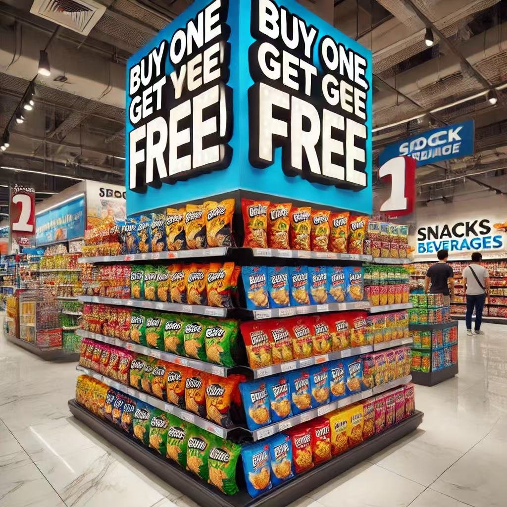
Impulse buying happens when customers make unplanned purchases. They may not have intended to buy certain items but do so after seeing them in the store. Retailers design store layouts to encourage these purchases. This strategy boosts sales while enhancing customer satisfaction.
Customers often act on emotions or immediate needs. They might see a small, attractive item and decide to buy it. Retailers use placement, lighting, and signage to trigger these impulses. The goal is to make products appealing and easy to grab.
Strategic Product Placement
Retailers place small, affordable items near the checkout counter. These items catch the eye while customers wait in line. Placing snacks, accessories, or promotional items here increases sales without being intrusive.
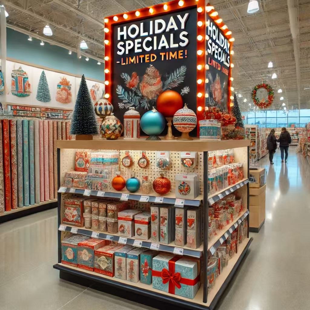
Seasonal displays also work well. Retailers position holiday-themed or limited-time products in highly visible areas. Shoppers feel a sense of urgency to buy before the products disappear. This strategy taps into their fear of missing out.
Creating a Journey Through the Store
Impulse buying isn’t limited to checkouts. Retailers design pathways that guide customers through the store. Along these routes, they place visually appealing displays. These displays encourage shoppers to stop and browse.
For example, a path leading to the grocery section might feature promotional snacks or drinks. Customers pick up these items on their way to buy essentials. The placement feels natural and convenient, making impulse purchases more likely.
The Power of Visual Merchandising
Visual merchandising plays a key role in impulse buying. Eye-catching displays, bold colors, and creative arrangements draw attention. Retailers use bright lighting to highlight products and create a welcoming atmosphere.
End caps—displays at the end of aisles—are particularly effective. These areas showcase best-sellers or new arrivals. Customers naturally notice them while walking through the store. This increases the chances of unplanned purchases.
Limited-Time Offers and Discounts
Promotions and discounts drive impulse buying. Retailers use signs that say “Buy One, Get One Free” or “Limited Time Offer.” These messages create urgency. Customers feel they need to act quickly to take advantage of the deal.
Flash sales or exclusive in-store discounts also work. Shoppers browsing casually might decide to buy because of a time-sensitive offer. Retailers make sure these deals are prominently displayed throughout the store.
Leveraging Technology for Impulse Buys
Technology enhances impulse buying opportunities. Digital screens and kiosks showcase promotional videos or special deals. These displays grab attention and provide additional information about the products.
Retailers also use mobile apps to send notifications about in-store offers. Customers receive these alerts while shopping, prompting them to check out the promoted items. QR codes placed near products make it easy to access discounts or learn more.
Cross-Selling and Upselling
Cross-selling encourages customers to buy related items. Retailers place complementary products together to create a sense of convenience. For example, a display featuring coffee might include mugs or snacks.
Upselling takes this a step further. Retailers suggest higher-value items as alternatives. For instance, they might promote a premium version of a product customers already intend to buy. Both strategies increase the likelihood of impulse purchases.
The Psychology of Impulse Buying
Retailers understand the psychology behind impulse buying. Emotions like excitement, curiosity, and urgency drive these decisions. Creating a positive shopping experience amplifies these feelings.
Stores often use music and pleasant scents to enhance the atmosphere. These sensory elements put customers in a good mood, making them more likely to buy spontaneously. Shoppers associate positive emotions with the products they encounter.
Testing and Refining Strategies
Retailers continually test their layouts and displays to improve impulse buys. They track customer behavior, such as which areas receive the most foot traffic. Based on this data, they adjust product placements and promotions.
Feedback also plays a role. Retailers listen to customer suggestions about store layout or product accessibility. These insights help them refine their strategies and create more effective setups.
Conclusion
Encouraging impulse buys is a critical part of retail strategy. Through thoughtful design, strategic placement, and emotional appeal, retailers boost sales while satisfying customer needs. From checkout counters to promotional displays, every element contributes to a seamless shopping experience.
Impulse buying benefits both customers and retailers. Shoppers discover products they might not have planned to buy, while stores enjoy increased revenue. By constantly innovating and adapting, retailers ensure their layouts stay effective and engaging.
Creating a Unique Brand Identity
Why Brand Identity Matters
Brand identity defines how customers perceive a store. It’s more than a logo or color scheme. It’s the overall feeling that a store conveys. Retailers use store layout, design elements, and ambiance to establish this identity.
A unique brand identity helps stores stand out. In a competitive market, customers remember brands that offer a distinct experience. Retailers who invest in creating their identity often enjoy greater customer loyalty.
Using Store Layout to Reflect Values
Store layouts communicate a brand’s core values. For example, eco-friendly brands might use open spaces and natural materials. These design choices align with their commitment to sustainability.
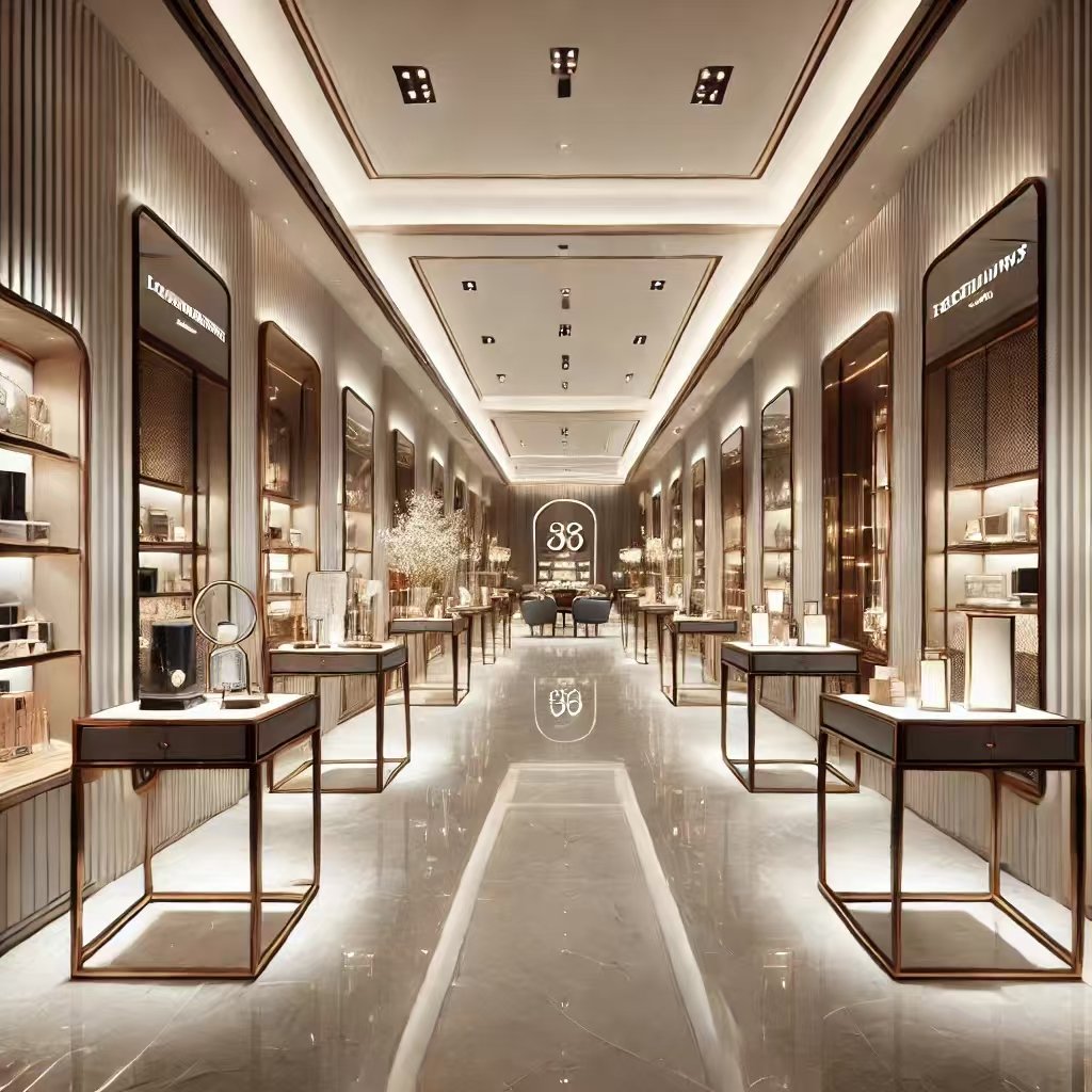
Luxury brands, on the other hand, focus on minimalism and elegance. Wide aisles, premium fixtures, and soft lighting convey exclusivity. Customers feel they are entering a high-end space, enhancing their perception of the brand.
Functional brands prioritize practicality. They use layouts that highlight efficiency and accessibility. Clear pathways, logical arrangements, and practical shelving systems make shopping easy.
Incorporating Visual Elements
Visual elements like colors, signage, and decor reinforce brand identity. Retailers choose colors that evoke specific emotions. For instance, warm tones create a welcoming feel, while cool tones suggest sophistication.
Signage also plays a role. Bold fonts and creative designs grab attention. They reflect the brand’s personality, whether it’s playful, professional, or luxurious. Murals, window displays, and product showcases complete the visual identity.
Lighting enhances these elements. Bright lighting suits discount stores, while dimmer, focused lighting fits boutiques. Lighting choices set the mood and complement the overall design.
Aligning with Target Customers
A unique brand identity resonates with the target audience. Retailers design their stores based on customer preferences and lifestyles. For example, boutique stores catering to young adults might use trendy decor and interactive displays.
Family-oriented stores focus on functionality and comfort. They provide wide aisles, seating areas, and clear signage. These features make shopping easier for parents with children.
Luxury brands appeal to affluent customers. They use high-end materials, private lounges, and personalized services. These elements make customers feel valued and connected to the brand.
Creating Memorable Experiences
A unique brand identity goes beyond aesthetics. It creates memorable experiences for customers. Retailers use sensory elements like music, scents, and textures to engage shoppers.
Music influences mood and shopping behavior. Upbeat tunes encourage quick purchases, while soft melodies create a relaxed atmosphere. Scents also enhance the experience. Luxury brands often use signature fragrances to leave a lasting impression.
Textures add depth to the design. Smooth, glossy surfaces suit modern brands, while rustic textures fit traditional ones. These tactile details contribute to the overall experience.
Connecting Through Storytelling
Retailers use storytelling to connect with customers. Every design element tells a story about the brand’s journey, values, or mission. For example, a local artisanal store might display handcrafted decor that reflects its heritage.
Visual storytelling engages customers emotionally. They feel connected to the brand’s narrative. This connection builds trust and loyalty. Customers are more likely to support brands they relate to on a personal level.
Adapting to Trends and Innovation
Brand identity evolves with trends and innovation. Retailers constantly update their layouts and designs to stay relevant. For example, many brands now incorporate technology into their identity.
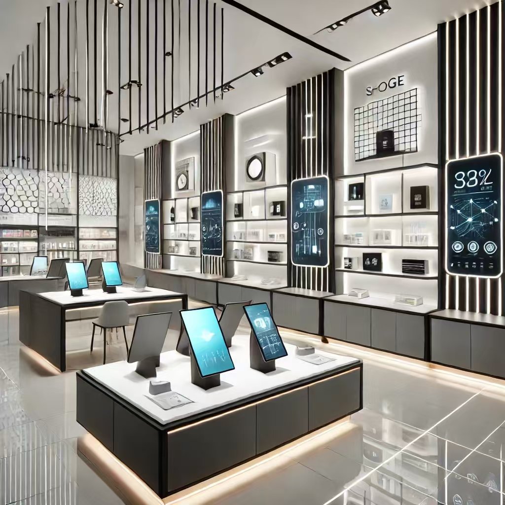
Interactive displays, digital screens, and smart shelves showcase a tech-savvy image. These innovations attract younger, tech-oriented audiences. Retailers also embrace sustainable practices to align with eco-conscious consumers.
Adapting to trends doesn’t mean abandoning core values. It means integrating new elements while staying true to the brand’s essence. This balance keeps the brand fresh and consistent.
Building Loyalty Through Consistency
Consistency strengthens brand identity. Retailers ensure their designs, services, and messaging align across all locations. A customer visiting different stores should experience the same feel.
For example, global brands like Apple maintain a uniform identity worldwide. Their stores share a clean, modern design that reflects innovation. Customers know what to expect, which builds trust.
Consistency also extends to online platforms. Retailers align their websites, apps, and social media with their physical stores. This unified identity creates a seamless customer journey.
Conclusion
Creating a unique brand identity is essential for retail success. It helps stores stand out, attract the right customers, and build loyalty. From layout and visual elements to storytelling and innovation, every detail contributes to this identity.
Retailers who prioritize brand identity enjoy long-term benefits. Customers remember and return to stores that offer a consistent and meaningful experience. A strong identity isn’t just a marketing tool—it’s a foundation for lasting success.
Improving Customer Retention
Why Customer Retention Matters
Customer retention is vital for any business. Retaining customers costs less than acquiring new ones. Loyal customers often spend more and promote the brand through word of mouth.
In retail, retaining customers means creating positive experiences. Satisfied shoppers return, driving consistent revenue. By focusing on retention, retailers build long-term relationships that sustain their business.
Building Memorable Experiences
Retailers improve retention by offering memorable shopping experiences. These experiences create emotional connections. Shoppers associate the brand with positive feelings, making them more likely to return.
For instance, interactive displays and personalized services enhance the shopping journey. Retailers use engaging layouts that invite exploration. Customers enjoy discovering new products, which keeps them coming back.
Additionally, creating a pleasant atmosphere is key. Music, lighting, and scents contribute to the experience. Customers who feel relaxed and happy are more likely to revisit the store.
Loyalty Programs That Work
Loyalty programs are effective tools for customer retention. Retailers reward repeat customers with discounts, points, or exclusive offers. These incentives encourage shoppers to choose the brand over competitors.
For example, a point-based system gives customers rewards for every purchase. Over time, these points translate into discounts or freebies. Shoppers feel appreciated and valued.
Tiered loyalty programs add exclusivity. Higher-spending customers receive premium benefits, such as early access to sales. This motivates customers to spend more and stay loyal.
Personalized Customer Experiences
Personalization strengthens customer relationships. Retailers use data to tailor offers and recommendations. Customers appreciate when a brand understands their preferences.
For instance, sending personalized emails with product suggestions or birthday discounts builds trust. In-store, sales associates can provide tailored advice. These small touches make customers feel special.
Technology plays a big role in personalization. Smart systems track purchase history and suggest complementary items. Retailers who invest in these systems see higher retention rates.
Creating Community Engagement
Retailers improve retention by fostering a sense of community. Customers feel more connected when they see a brand as more than just a store.
Hosting events, workshops, or exclusive gatherings strengthens these connections. For example, a store might hold a VIP shopping night for loyal customers. Such events create unique experiences and build deeper relationships.
Social media also helps. Engaging with customers online keeps the brand relevant. Sharing user-generated content or replying to comments makes customers feel appreciated.
Seamless Omnichannel Experiences
Modern customers value convenience. Retailers who offer seamless omnichannel experiences retain more customers. This means integrating online and offline shopping.
For example, allowing customers to buy online and pick up in-store saves time. Easy returns across channels also boost satisfaction. Customers who enjoy flexible options are more likely to stay loyal.
Consistency across platforms is essential. A store’s website, app, and physical location should share the same branding and service quality. This unified experience builds trust and familiarity.
Prioritizing Customer Feedback
Listening to customers improves retention. Feedback helps retailers identify pain points and make improvements. Customers who see their concerns addressed feel valued.
Retailers collect feedback through surveys, reviews, or in-store interactions. For example, a retailer might send post-purchase surveys via email. Analyzing this feedback helps improve the shopping experience.
Acting on feedback builds loyalty. Customers notice when brands take their suggestions seriously. This encourages them to return and recommend the store to others.
Training Employees to Enhance Service
Employees play a key role in customer retention. Friendly, knowledgeable staff create a welcoming environment. Shoppers remember positive interactions and return for similar experiences.
Retailers train employees to provide excellent service. They teach communication skills, product knowledge, and problem-solving. Well-trained staff can handle customer concerns effectively, leaving a lasting impression.
Incentives for employees also boost retention. Motivated staff are more likely to go the extra mile for customers. This improves the overall shopping experience and encourages repeat visits.
Adapting to Customer Needs
Retailers retain customers by adapting to their evolving needs. Trends, preferences, and expectations change over time. Staying relevant ensures continued loyalty.
For instance, retailers might introduce sustainable products to appeal to eco-conscious customers. Offering new payment methods, like mobile wallets, also enhances convenience. Adapting shows that the brand cares about its customers’ preferences.
Technology helps retailers stay agile. Data analytics reveal customer behavior and trends. This allows brands to anticipate needs and adjust accordingly.
Conclusion
Improving customer retention is essential for retail success. Retailers achieve this by creating memorable experiences, offering loyalty programs, and personalizing services. Building community engagement and providing seamless omnichannel options further strengthen retention.
Prioritizing feedback, training employees, and adapting to customer needs also play a significant role. Loyal customers bring consistent revenue, promote the brand, and contribute to long-term growth.
By focusing on retention, retailers build lasting relationships. These relationships drive repeat business and ensure sustainable success in a competitive market.
Adjusting for Seasonal Trends
Why Seasonal Adjustments Matter
Seasonal trends influence shopping behavior. Customers look for different products during holidays, summer, or winter. Retailers adapt their layouts to match these trends. By doing so, they stay relevant and meet customer needs.
Seasonal adjustments also create excitement. Shoppers enjoy exploring new displays and themed decorations. These changes keep the store experience fresh and engaging. Retailers who embrace seasonal trends often see higher foot traffic and sales.
Creating Holiday-Themed Displays
Holidays provide excellent opportunities for retailers. Stores transform their layouts to reflect festive themes. For example, during Christmas, retailers add lights, garlands, and red-and-green decor.
Product displays also align with the holiday theme. Retailers highlight gifts, seasonal foods, or holiday decorations. These displays attract attention and encourage impulse purchases.
Promotional signage reinforces the theme. Phrases like “Holiday Sale” or “Limited-Time Offers” create urgency. Customers feel motivated to buy before the season ends.
Adjusting for Summer and Winter Needs
Seasons like summer and winter impact shopping priorities. Retailers adjust their layouts to feature seasonal products. For example, in summer, stores highlight outdoor items, swimwear, and sunscreen.
Winter brings a focus on warm clothing, holiday decorations, and gifts. Retailers rearrange shelves to make these items more accessible. They also create cozy, warm atmospheres to match the season’s mood.
Seasonal colors enhance the theme. Bright colors suit summer, while warm tones fit winter. These visual cues help customers connect with the season’s vibe.
Highlighting Limited-Time Products
Seasonal trends often bring exclusive products. Retailers use special sections to showcase these items. For instance, Valentine’s Day displays might feature chocolates, flowers, and greeting cards.
These sections are strategically placed in high-traffic areas. Customers notice them while exploring the store. Retailers also use signage to emphasize that these products are only available for a short time.
The fear of missing out (FOMO) drives impulse purchases. Customers feel encouraged to buy before the season ends. This strategy boosts sales and creates excitement.
Using Seasonal Promotions
Promotions play a key role in seasonal adjustments. Retailers offer discounts, bundles, or giveaways to attract shoppers. These deals are often tied to holidays or special events.
Promotions encourage customers to explore the store. For example, a “Back-to-School Sale” might feature discounted stationery, backpacks, and clothing. Customers looking for these items are likely to browse other sections as well.
Retailers also use promotional events to draw crowds. Seasonal pop-ups, workshops, or in-store activities create buzz. These events enhance the shopping experience and build customer loyalty.
Incorporating Seasonal Decor
Seasonal decor transforms the store environment. Retailers use props, colors, and lighting to create an immersive experience. For instance, Halloween-themed stores might feature pumpkins, cobwebs, and spooky lighting.
Decor doesn’t just enhance aesthetics; it influences shopping behavior. Customers feel more engaged in a themed environment. This encourages them to spend more time browsing and buying.
Retailers update decor regularly to maintain interest. Shoppers notice new elements each time they visit. This keeps the experience exciting and encourages repeat visits.
Adapting to Regional Trends
Seasonal trends vary by region. Retailers must understand local preferences and adapt accordingly. For example, stores in colder climates may focus more on winter essentials.
Cultural differences also affect seasonal adjustments. In some countries, Lunar New Year or Diwali are major shopping seasons. Retailers align their layouts and promotions with these events.
Adapting to regional trends ensures relevance. Customers feel valued when stores cater to their specific needs and traditions.
Leveraging Technology for Seasonal Trends
Technology enhances seasonal adjustments. Digital screens and kiosks display themed promotions or seasonal videos. These visuals grab attention and create a dynamic experience.
Retailers also use data to track seasonal trends. Sales data helps identify popular products for each season. This insight guides layout changes and inventory management.
Mobile apps and websites support seasonal campaigns. Retailers send notifications about in-store events or exclusive offers. These digital tools keep customers engaged during seasonal transitions.
Planning for Seasonal Changes
Seasonal adjustments require planning. Retailers analyze past performance to predict trends. They prepare layouts, decor, and promotions in advance.
Inventory management is critical. Retailers stock up on seasonal products early to avoid shortages. They also ensure smooth transitions between seasons. For example, summer items are phased out as fall products take their place.
Effective planning ensures a seamless customer experience. Shoppers appreciate stores that anticipate their needs and deliver consistently.
Conclusion
Adjusting for seasonal trends is essential in retail. It keeps stores relevant, exciting, and aligned with customer expectations. From holiday displays to summer essentials, every adjustment enhances the shopping experience.
Retailers who embrace seasonal changes enjoy higher sales and stronger customer loyalty. By planning and leveraging technology, they create engaging and memorable experiences. Seasonal trends aren’t just about following the calendar—they’re about connecting with customers at the right time.
Utilizing Technology
Why Seasonal Adjustments Matter
Seasonal trends influence shopping behavior. Customers look for different products during holidays, summer, or winter. Retailers adapt their layouts to match these trends. By doing so, they stay relevant and meet customer needs.
Seasonal adjustments also create excitement. Shoppers enjoy exploring new displays and themed decorations. These changes keep the store experience fresh and engaging. Retailers who embrace seasonal trends often see higher foot traffic and sales.
Creating Holiday-Themed Displays
Holidays provide excellent opportunities for retailers. Stores transform their layouts to reflect festive themes. For example, during Christmas, retailers add lights, garlands, and red-and-green decor.
Product displays also align with the holiday theme. Retailers highlight gifts, seasonal foods, or holiday decorations. These displays attract attention and encourage impulse purchases.
Promotional signage reinforces the theme. Phrases like “Holiday Sale” or “Limited-Time Offers” create urgency. Customers feel motivated to buy before the season ends.
Adjusting for Summer and Winter Needs
Seasons like summer and winter impact shopping priorities. Retailers adjust their layouts to feature seasonal products. For example, in summer, stores highlight outdoor items, swimwear, and sunscreen.
Winter brings a focus on warm clothing, holiday decorations, and gifts. Retailers rearrange shelves to make these items more accessible. They also create cozy, warm atmospheres to match the season’s mood.
Seasonal colors enhance the theme. Bright colors suit summer, while warm tones fit winter. These visual cues help customers connect with the season’s vibe.
Highlighting Limited-Time Products
Seasonal trends often bring exclusive products. Retailers use special sections to showcase these items. For instance, Valentine’s Day displays might feature chocolates, flowers, and greeting cards.
These sections are strategically placed in high-traffic areas. Customers notice them while exploring the store. Retailers also use signage to emphasize that these products are only available for a short time.
The fear of missing out (FOMO) drives impulse purchases. Customers feel encouraged to buy before the season ends. This strategy boosts sales and creates excitement.
Using Seasonal Promotions
Promotions play a key role in seasonal adjustments. Retailers offer discounts, bundles, or giveaways to attract shoppers. These deals are often tied to holidays or special events.
Promotions encourage customers to explore the store. For example, a “Back-to-School Sale” might feature discounted stationery, backpacks, and clothing. Customers looking for these items are likely to browse other sections as well.
Retailers also use promotional events to draw crowds. Seasonal pop-ups, workshops, or in-store activities create buzz. These events enhance the shopping experience and build customer loyalty.
Incorporating Seasonal Decor
Seasonal decor transforms the store environment. Retailers use props, colors, and lighting to create an immersive experience. For instance, Halloween-themed stores might feature pumpkins, cobwebs, and spooky lighting.
Decor doesn’t just enhance aesthetics; it influences shopping behavior. Customers feel more engaged in a themed environment. This encourages them to spend more time browsing and buying.
Retailers update decor regularly to maintain interest. Shoppers notice new elements each time they visit. This keeps the experience exciting and encourages repeat visits.
Adapting to Regional Trends
Seasonal trends vary by region. Retailers must understand local preferences and adapt accordingly. For example, stores in colder climates may focus more on winter essentials.
Cultural differences also affect seasonal adjustments. In some countries, Lunar New Year or Diwali are major shopping seasons. Retailers align their layouts and promotions with these events.
Adapting to regional trends ensures relevance. Customers feel valued when stores cater to their specific needs and traditions.
Leveraging Technology for Seasonal Trends
Technology enhances seasonal adjustments. Digital screens and kiosks display themed promotions or seasonal videos. These visuals grab attention and create a dynamic experience.
Retailers also use data to track seasonal trends. Sales data helps identify popular products for each season. This insight guides layout changes and inventory management.
Mobile apps and websites support seasonal campaigns. Retailers send notifications about in-store events or exclusive offers. These digital tools keep customers engaged during seasonal transitions.
Planning for Seasonal Changes
Seasonal adjustments require planning. Retailers analyze past performance to predict trends. They prepare layouts, decor, and promotions in advance.
Inventory management is critical. Retailers stock up on seasonal products early to avoid shortages. They also ensure smooth transitions between seasons. For example, summer items are phased out as fall products take their place.
Effective planning ensures a seamless customer experience. Shoppers appreciate stores that anticipate their needs and deliver consistently.
Conclusion
Adjusting for seasonal trends is essential in retail. It keeps stores relevant, exciting, and aligned with customer expectations. From holiday displays to summer essentials, every adjustment enhances the shopping experience.
Retailers who embrace seasonal changes enjoy higher sales and stronger customer loyalty. By planning ahead and leveraging technology, they create engaging and memorable experiences. Seasonal trends aren’t just about following the calendar—they’re about connecting with customers at the right time.
Focusing on Accessibility
Why Accessibility Matters in Retail
Accessibility ensures that all customers can enjoy a seamless shopping experience. It is essential for inclusivity and equality. Retailers who prioritize accessibility create welcoming environments for people of all abilities.
By focusing on accessibility, stores cater to a broader audience. This includes customers with disabilities, parents with strollers, and elderly shoppers. An accessible store layout shows that the brand values its customers’ needs. This builds trust and loyalty over time.
Designing Barrier-Free Entrances
The entrance sets the first impression of accessibility. Retailers often install automatic doors or ramps to accommodate all visitors. These features make it easier for customers with wheelchairs, walkers, or strollers to enter the store.
Clear signage also helps. Labels for accessible entrances and pathways guide customers effectively. Well-designed entryways create an inclusive atmosphere from the start.
Wide doors and step-free entryways are also critical. These adjustments ensure everyone can enter without difficulty. Retailers who invest in such features demonstrate their commitment to accessibility.
Creating Spacious Aisles and Pathways
Inside the store, retailers prioritize wide aisles. Narrow pathways can make navigation difficult for customers with mobility aids. Spacious layouts allow everyone to move freely and comfortably.
Pathways must remain clutter-free. Retailers avoid placing products or promotional displays in walking areas. Clear routes improve the shopping experience for all customers.
Retailers also consider turning space for wheelchairs. Corners and intersections need enough room to allow smooth movement. These thoughtful details make a big difference.
Adding Elevators and Ramps
In multi-level stores, elevators and ramps are essential. Stairs alone exclude customers with limited mobility. Elevators provide easy access to the upper floors.
Ramps are equally important. They accommodate customers with wheelchairs or strollers. Retailers often design ramps with gentle slopes and non-slip surfaces. This ensures safety and usability.
Accessible stores also include handrails on ramps and staircases. These additions offer extra support for elderly customers or those with balance issues.
Providing Accessible Fitting Rooms
Fitting rooms should cater to all customers. Retailers include at least one accessible fitting room in their layout. These rooms are larger than standard ones, allowing space for mobility aids.
Features like grab bars, benches, and adjustable mirrors enhance usability. Clear signage directs customers to these fitting rooms. Retailers ensure these spaces meet accessibility standards.
Well-designed fitting rooms improve customer satisfaction. Shoppers feel valued when stores consider their unique needs.
Installing Clear Signage
Signage plays a significant role in accessibility. Retailers use large fonts, high-contrast colors, and universal symbols. These designs make signs easier to read for everyone.
Directional signs guide customers to different sections of the store. Labels for restrooms, fitting rooms, and exits are essential. Braille signage further enhances accessibility for visually impaired customers.
Digital screens with voice assistance offer another layer of inclusivity. These features help customers navigate the store independently.
Including Accessible Checkout Areas
Checkout counters should accommodate all customers. Retailers design at least one counter with a lower height. This allows wheelchair users to complete transactions comfortably.
Contactless payment options also improve accessibility. Customers can pay quickly without struggling with card readers or cash. Retailers position these systems within easy reach.
Staff training enhances the accessibility of checkout areas. Employees assist customers with disabilities as needed. Friendly, attentive service creates a positive shopping experience.
Enhancing Restroom Accessibility
Accessible restrooms are vital in retail stores. These spaces should include grab bars, wide doors, and enough room for wheelchairs. Emergency call buttons add an extra layer of safety.
Retailers also ensure restrooms are easy to find. Clear signs and directions guide customers to these facilities. A clean, accessible restroom improves the overall shopping experience.
Incorporating Technology for Accessibility
Technology makes stores more accessible. Digital kiosks with touchscreens help customers locate products. Voice-activated systems provide an alternative for those with limited mobility or vision.
Mobile apps enhance accessibility too. Some apps offer navigation tools that guide customers through the store. Others provide information about accessible features like ramps and elevators.
Smart carts equipped with navigation systems assist customers with disabilities. These innovations show how technology can bridge gaps in accessibility.
Creating an Inclusive Atmosphere
Beyond physical adjustments, accessibility includes creating a welcoming environment. Retailers train staff to assist customers with diverse needs. Employees learn to provide respectful and effective service.
Inclusivity also involves listening to feedback. Retailers regularly ask customers about their experiences. This helps them identify areas for improvement.
Stores that focus on accessibility foster a sense of community. Customers feel appreciated and supported, leading to long-term loyalty.
Conclusion
Focusing on accessibility benefits both customers and retailers. Inclusive design ensures that everyone can navigate the store comfortably. From barrier-free entrances to advanced technology, every detail matters.
Accessible stores attract a wider audience and build strong customer relationships. Retailers who prioritize inclusivity not only improve sales but also create meaningful shopping experiences. This commitment to accessibility reflects the true spirit of modern retail.
Conclusion
Guiding Customer Flow
Store layout design guides customers through the space. Retailers use strategic pathways and clear signage to direct shoppers. This improves navigation and encourages exploration. Customers feel comfortable knowing where to go, which keeps them engaged longer.
Maximizing Product Visibility
Layouts enhance product visibility by placing items in high-traffic areas. End caps, promotional displays, and front entrances showcase key products. Bright lighting and creative arrangements draw attention. This strategy boosts sales and creates a memorable shopping experience.
Encouraging Impulse Buys
Retailers design layouts to encourage unplanned purchases. Small, affordable items near checkouts tempt shoppers waiting in line. Seasonal displays and limited-time offers create urgency. These tactics benefit both retailers and customers.
Reflecting Brand Identity
A store’s layout reflects its brand. Luxury brands use spacious, elegant designs, while discount stores focus on practicality. Visual elements like colors, lighting, and signage reinforce the brand’s personality. These choices connect with target audiences and build loyalty.
Enhancing Comfort and Accessibility
Comfortable layouts improve the shopping experience. Wide aisles, seating areas, and climate control make customers feel welcome. Accessible designs ensure inclusivity for all shoppers. Retailers who prioritize comfort and accessibility attract more loyal customers.
Leveraging Technology and Trends
Modern layouts incorporate technology to improve shopping. Digital displays, interactive kiosks, and mobile apps enhance customer engagement. Retailers also adapt layouts for seasonal trends to keep stores fresh and exciting.
Creating Memorable Experiences
Store layouts create memorable experiences by engaging customers’ senses. Music, lighting, and scents set the mood. Strategic layouts make shopping enjoyable and efficient. Customers associate these positive experiences with the brand, encouraging repeat visits.
Store layout design plays a vital role in retail success. It guides shoppers, showcases products, and creates a welcoming atmosphere. Retailers who invest in thoughtful layouts improve sales and customer satisfaction. A well-designed store enhances every aspect of the retail experience.
