
Understanding how retail stores display their merchandise helps me design smarter fixtures for my global clients. Every layout tells a sales story. In this article, I’ll share how stores make product presentation work—and how I help them win. Retail stores display items in retail using shelves, display cases, and slatwall systems to attract buyers, boost visibility.
Understand Retail Display Basics
Visual Storytelling Starts with Display Logic
Every store tells a story through its layout. The way products are arranged influences how shoppers move, think, and decide. Clear visual logic helps guide attention and trigger interest. That’s why understanding the foundation of retail display is so important.
Good merchandising begins with purpose. Displays must support a store’s identity. Whether targeting luxury buyers or bargain hunters, the presentation shapes perception. Fixtures, product spacing, signage, and lighting work together to form that first impression.
In practice, retailers use these tools to direct movement and create moods. A well-lit glass case might suggest exclusivity. A playful slatwall display suggests convenience and fun. Customers notice these small design cues subconsciously. That’s why professional displays convert better. They do more than hold merchandise—they shape customer behavior.
When the layout reflects brand positioning, it builds trust. This trust turns casual browsers into repeat buyers. Instead of relying only on product quality, smart retailers shape environments that elevate product value through storytelling.
Cleanliness, Clarity, and Space Build Trust
Nothing discourages customers faster than visual clutter. Crowded shelves, mixed categories, or poor lighting create confusion. Effective displays, on the other hand, rely on negative space and organization.
Retailers who create breathing room between products gain customer confidence. This doesn’t mean empty shelves. It means planned spacing that feels intentional. Clarity supports browsing and helps reduce decision fatigue. When people understand what they’re looking at, they feel in control.
Even budget-conscious stores benefit from clean presentation. A discount shop with organized racks feels more trustworthy than a chaotic boutique with designer items. That’s why layout must prioritize structure over randomness.
Another key factor is lighting. Strategic lighting helps draw attention and creates focus. Highlighting a featured product or spotlighting a seasonal display can dramatically increase conversions. Even lighting tone matters—warm for cozy, cool for modern. Lighting becomes part of the merchandise when used correctly.
Visual order reflects operational excellence. When stores appear clean and structured, customers assume the business is reliable. That belief drives confidence, which drives sales. Good displays, then, do more than showcase products—they demonstrate brand values.
Merchandise Should Guide Movement
People follow visual cues without realizing it. Store layouts use this instinct to guide shoppers from one section to the next. Every display becomes a signpost. Each aisle becomes a suggestion. This flow defines how long people stay, what they see, and what they buy.
Retailers often use anchor displays to pull people deeper into the store. These might be seasonal features, endcap promotions, or large glass showcases near the center. Once customers engage with a central point, smaller displays take over. This progression keeps interest high.
Changes in height and texture also play a role. A switch from wood counters to metal fixtures can signal a product category shift. These small changes guide motion while keeping customers engaged. It’s not about walls—it’s about rhythm. The more comfortable the pace, the longer customers linger.
Even background music, scent, and signage support this flow. Retailers who combine all elements—fixtures, product placement, and environmental cues—create memorable experiences. These experiences lead to better brand recall and higher conversion rates. Display basics are not just about furniture. They’re about movement.
Product Presentation Should Feel Intentional
Intentionality drives customer trust. When displays look thought-out, customers assume the store values quality. Random piles of products suggest carelessness. But neatly spaced items, aligned edges, and clear pricing make a big difference.
Every display decision counts. How many products per shelf? Which angle should they face? Should they sit in rows or on staggered levels? These questions matter. Answering them properly results in displays that invite interaction.
Price tags should never hang loosely. Shelves should stay dust-free. Signage must be visible and helpful. When stores take time to set these standards, customers notice. These small choices add up to a more polished, professional feel.
Store owners should also keep displays dynamic. Static presentation loses impact. Small rotations each week give the impression of freshness. Retailers who change layouts regularly often see stronger foot traffic and return visits. People enjoy seeing something new.
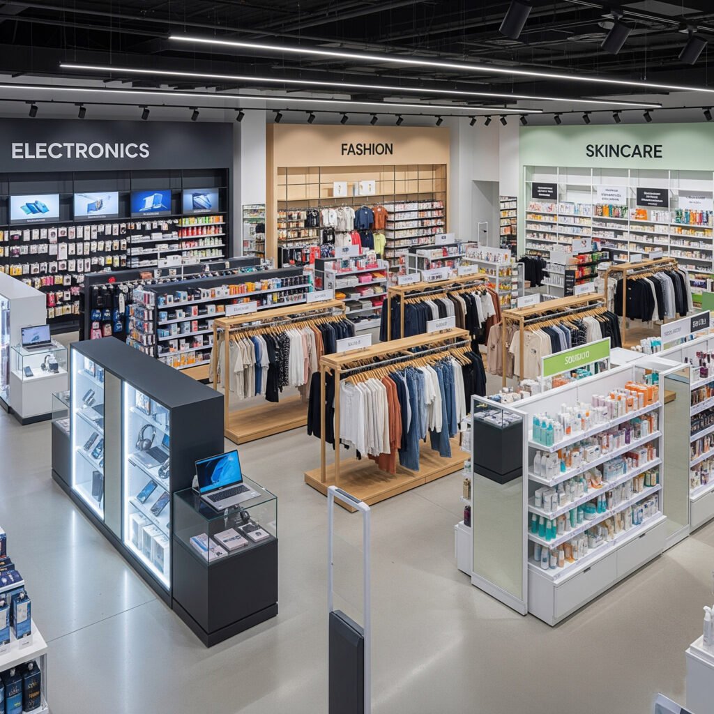
Choose the Right Display Types
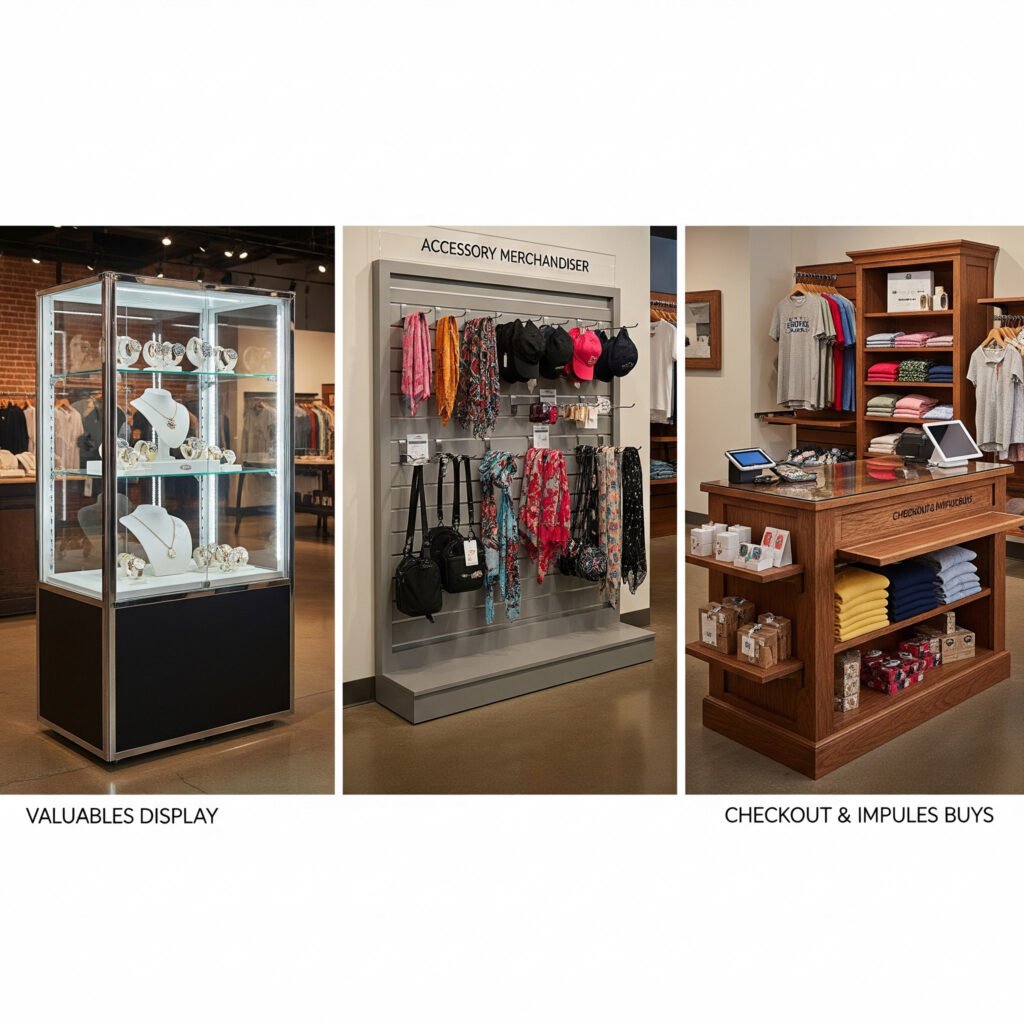
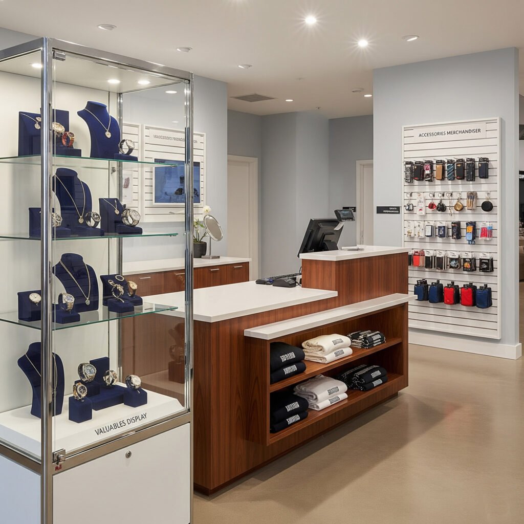
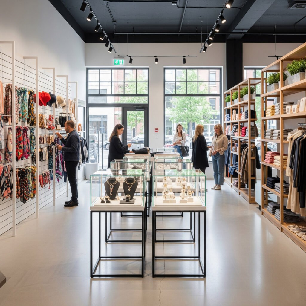
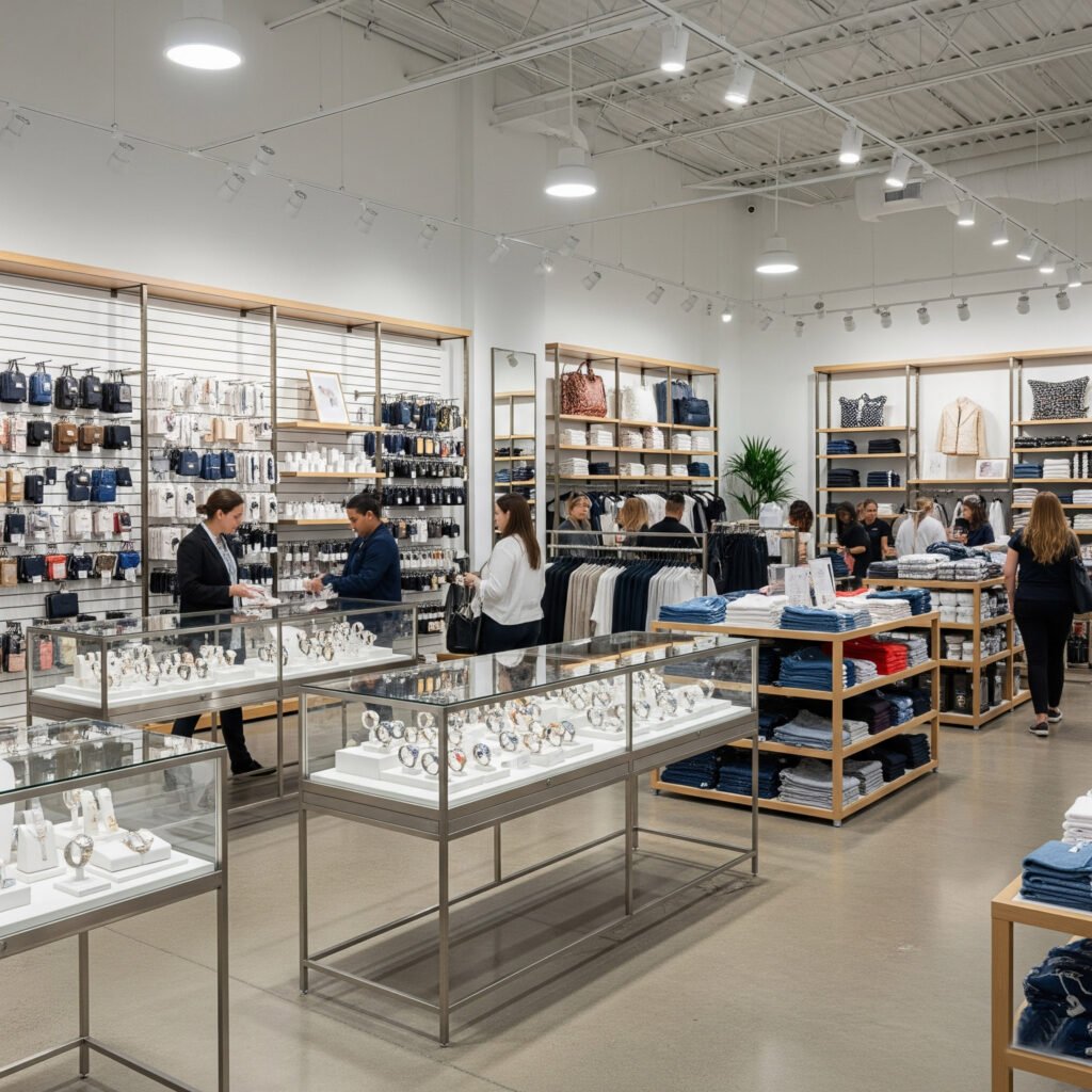
Glass Showcases Create Security and Elegance
Glass showcases offer both protection and presentation. They protect valuable merchandise from theft or damage while still letting customers see the product clearly. Jewelry, electronics, collectibles, and vape devices are often best displayed inside secure glass enclosures. Many retailers choose these cases for their professional look and customer appeal.
Tempered glass enhances safety. Unlike regular glass, it resists impact and doesn’t shatter easily. This gives peace of mind to staff and shoppers alike. Adjustable lighting inside the case helps focus attention. Products placed under bright, clean lights often feel more premium. That helps increase perceived value.
Placement plays a big role. Countertop showcases work well near cashiers, while freestanding units suit central aisles or store corners. Lockable options ensure security without sacrificing style. Retailers who use glass showcases say customer trust increases when products are protected yet visible. Showcases can also be customized to match brand style with finishes like wood bases or brushed metal frames.
Glass showcases answer the question of how retail stores display their merchandise in a way that looks high-end and keeps goods secure. In boutiques or specialized stores, they often become the centerpiece of the layout.
Slatwall Merchandisers Offer Flexibility and Volume
When space is tight or items change often, slatwall systems deliver unmatched flexibility. These vertical panels can be fitted with hooks, shelves, bins, or baskets. That makes it easy to reconfigure a display overnight. Clothing, tools, phone accessories, and beauty products all work well on slatwalls.
Retailers use slatwalls to maximize wall space without sacrificing floor area. By taking advantage of vertical zones, stores create an organized, layered look. Color options and woodgrain finishes allow the panels to match different retail styles. This helps the wall system blend in or stand out, depending on the store’s design.
Adjustments are quick. When new inventory arrives or promotional items rotate, slatwalls allow instant rearrangement. Seasonal sales, themed sections, and even clearance zones can all be built using the same panel system. That’s why many stores in Sweden and the USA rely on slatwalls for fast merchandising updates.
The system works best in combination with center-floor displays. While slatwalls line the walls, freestanding fixtures create movement in the middle. Together, they form a complete visual experience. So when asking how do retail stores display their merchandise with flexibility, slatwalls remain a smart and scalable solution.
Wooden Counters Add Warmth and Functionality
Retail environments often need a balance of utility and aesthetics. Wood counters provide both. They serve as transaction points, storage zones, and display platforms—all in one. Many stores choose them to create a welcoming, handcrafted feel.
Finishes like maple, oak, or walnut can match brand themes and interior styles. Warm tones help soften the look of modern stores. A counter with glass panels allows partial display, blending functionality with presentation. Adding LED lighting inside enhances the effect and guides attention.
Behind the counter, shelves or drawers offer storage for supplies, paperwork, or extra merchandise. This helps keep the front of the store tidy and focused. Some counters also feature built-in cable management for POS systems. Retailers who operate on a small footprint find this design especially helpful.
Positioning also matters. Counters near entrances set the tone for customer service. Those placed at store centers work as anchor zones. How do retail stores display their merchandise in ways that also improve workflow? A multifunctional counter is often the answer. It improves service, adds character, and helps build trust.
Tiered Displays Maximize Visibility in Small Spaces
Not every product needs to sit behind glass or hang on a wall. Tiered displays work well for mid-sized merchandise like books, cosmetics, folded apparel, and snacks. These stepped fixtures offer layered visibility, letting products shine without overlapping.
They come in various heights and widths. Lower tiers work for countertops, while taller units stand freely on the floor. The stair-step structure keeps every item visible from the front. This encourages touch, exploration, and quick selection. Placing promotional signs on top adds a final visual cue to drive action.
Materials include wood, metal, or acrylic. Stores can pick the look that matches their brand. Lightweight designs make it easy to move them around. That’s useful for high-traffic areas that change often. Retailers also use tiered displays near checkout zones to boost last-minute purchases.
These displays often accompany limited-time offers. How do retail stores display their merchandise when shelf space is limited? Tiered racks provide a practical and compact solution. They fill corners, add height, and create extra focus without overwhelming the layout.
Organize Based on Product Category

Separate by Function for Clearer Browsing
Grouping products by use or function allows customers to navigate the space with ease. Shoppers instinctively look for similar items in the same area. This approach reduces confusion and encourages browsing. Functional zones simplify the shopping experience and create a sense of order.
Retailers often use this method for apparel, electronics, cosmetics, or kitchenware. For example, placing all men’s shoes in one zone and women’s shoes in another helps people compare options. Slatwall panels with clear labels or icon signage can further guide the flow. Display fixtures need to support this division by offering enough flexibility for rearrangement.
Additionally, when stores organize based on function, sales teams work more efficiently. It’s easier to restock, track inventory, and assist customers. This setup also improves upselling opportunities, especially when accessories are nearby. Grouping functionally saves time and increases cart value.
Use Vertical and Horizontal Zones Wisely
Proper zoning isn’t only about grouping items. It’s also about how those items are positioned within the display space. Many retailers overlook the balance between vertical and horizontal displays. Yet, this decision affects visibility and customer movement.
Vertical zones let stores use wall space efficiently. Slatwalls, hanging racks, and tall shelving units lift lighter products to eye level. Heavy items stay near the ground. That improves safety and comfort. Horizontal space, such as tables and mid-height counters, works well for featured products or impulse buys.
Combining both layouts creates a layered presentation. The eye moves naturally from top to bottom. Customers stay longer when displays feel engaging but not overwhelming. Fixtures should offer adjustable heights and modular options. Stores that follow these visual rules report better traffic flow and higher customer satisfaction.
Reinforce Themes with Color and Texture
Organizing by category doesn’t stop at layout. Color and texture reinforce the message. Visual merchandising relies on these cues to shape mood and guide the eye. This method works especially well when promoting seasonal items or curated collections.
Shades of the same color family create visual harmony. A skincare section, for example, may use soft pastels, light woods, and warm lighting to enhance a relaxing feel. Grouping by label design or packaging style also helps customers compare similar items. This uniformity builds trust and adds perceived value.
Texture adds dimension. Wood, glass, or fabric elements subtly signal category type. A tech section benefits from glass and metal finishes, while handmade goods look better with natural tones and raw textures. Coordinating color and material gives every section a unique identity while staying on brand.
Highlight Key Categories with Signage
Even the most organized layout needs support from clear signage. Labels help customers understand what they’re seeing at a glance. Well-placed signs reduce friction and answer common questions without needing staff intervention.
Bold category headers—like “Gadgets,” “Home Decor,” or “New Arrivals”—guide traffic and help define zones. In multilingual markets, icons and simple graphics ensure clarity across languages. Acrylic shelf talkers, wooden placards, or even digital tablets serve as effective signage.
Signage also boosts promotions. Highlighting “50% Off Clearance” within a category increases urgency. Customers browsing a category zone are already interested. A sign simply gives them a reason to act now. Fixtures should offer surfaces for attaching small signs or built-in card holders.
Well-designed signage creates a professional feel. It also contributes to better product memory. Shoppers are more likely to return when they can mentally map a store layout. That long-term familiarity increases loyalty and overall sales.
Why Fairwill Display
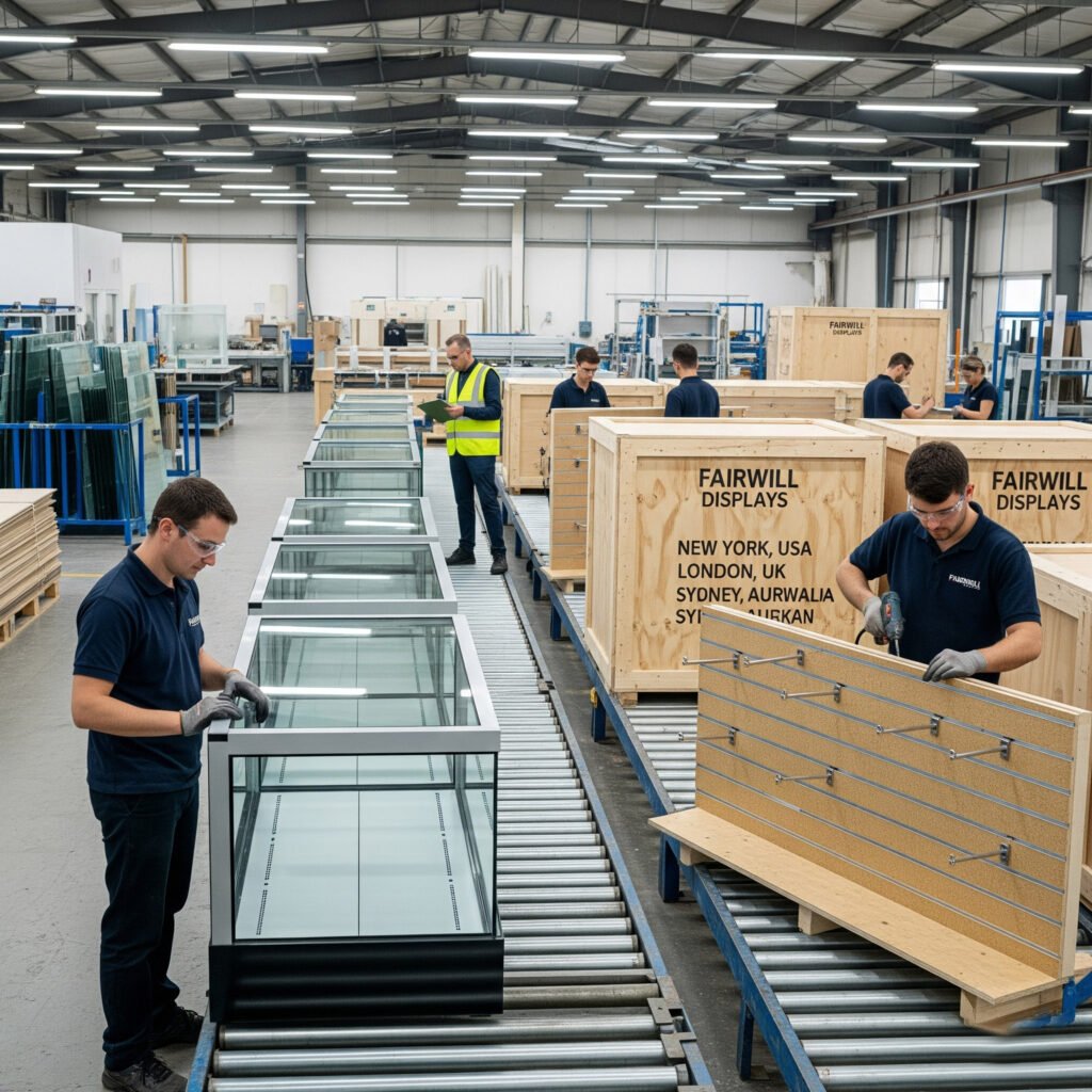
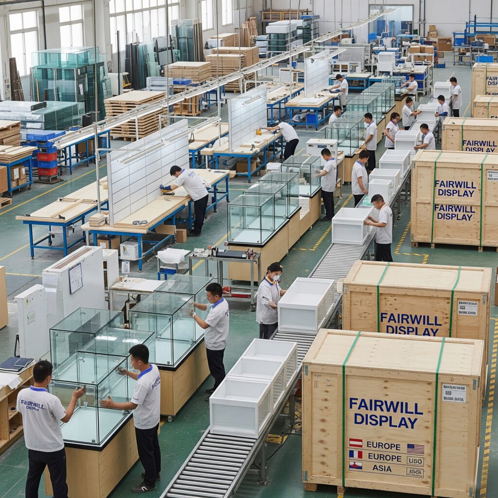
Direct Factory Pricing That Protects My Margins
Finding the right supplier matters. In this business, small price differences affect the entire bottom line. Fairwill Display gives me factory-direct pricing with no middleman.
That means I save instantly on every bulk order. Their prices are 20%–30% lower than most alternatives I’ve seen. Yet, the product quality remains excellent. This combination is rare.
Orders come straight from their own factory. No extra layers. No slow communication. I deal directly with the source. That improves accuracy and speed. It also gives me confidence that my money goes further.
Consistent Quality with Every Shipment
Many suppliers claim to offer quality. Few deliver it consistently. Fairwill Display stands out. Their materials meet high standards. Every piece feels solid and finished.
They use E1-grade boards, which are clean and safe. That’s important, especially for European markets. Their glass is always tempered, never cheap float glass. It holds up during transport and looks premium in-store.
Each item is packed with care. Protective corners, bubble wrap, and clear labeling make a difference. My shipments arrive in perfect condition, even after long ocean journeys.
There’s also visual consistency. Color, thickness, and finish match every time. That makes repeat orders smooth and reliable.
Customization and Flexibility That Fit My Needs
Retail isn’t one-size-fits-all. Every project has its own requirements. Fairwill Display understands that. They offer tailored solutions with no resistance.
I’ve asked for non-standard sizes, added lighting, and even adjusted drawer styles. Their team handles these changes with ease. They send drawings, suggest improvements, and keep communication clear.
They also help with materials and finishes. If I need a certain wood tone or display height, they guide me through options. That kind of flexibility saves me time and avoids costly mistakes.
Even small clients get this attention. That shows me they care about long-term relationships, not just big orders.
Real Advice That Helps Me Sell More
Fairwill Display isn’t just a manufacturer. They act like a retail partner. Their advice has helped me design better stores and improve product placement.
When I built a new boutique section, they recommended using slatwall for flexibility. They also suggested using glass showcases near the entrance to feature high-value items. Those suggestions increased visibility and helped drive more sales.
They think like retailers. They understand shopper behavior. That expertise gives me a competitive edge.
They even helped me plan the layout flow. Their suggestions on lighting, spacing, and shelving made the store more inviting. That’s hard to find in a factory.
Fast Communication and Global Shipping Support
Shipping from overseas can be stressful. Delays, damage, or customs issues waste time. With Fairwill Display, I feel supported every step.
Their team replies quickly. Emails don’t go unanswered. When I have questions, I get clear answers fast. They also provide packing lists, product photos, and container load plans before shipping. That makes planning smoother.
Their experience with international orders shows. Whether I ship to the USA or Sweden, they prepare the right documents. Customs clearance becomes easier. My products arrive on time and are ready to sell.
That kind of professionalism matters. It helps me plan promotions and restocking with confidence.
A Partner I Trust, Not Just a Supplier
Working with Fairwill Display feels different. They don’t just sell, but also solve problems. Every time I place an order, I feel reassured. Their team stands behind their work. Their service continues even after delivery. They’ve helped me reduce costs, avoid delays, and improve customer experience in my store. That’s the kind of partnership I value.
If you want reliable pricing, strong products, and real support, Fairwill Display is worth your attention. Send them an inquiry. You’ll see why so many wholesalers choose to come back.